People get very attached to the way a product they use currently works and feels. If someone proposes a change to the status quo, there will be pushback, even if the proposal would bring significant improvements.
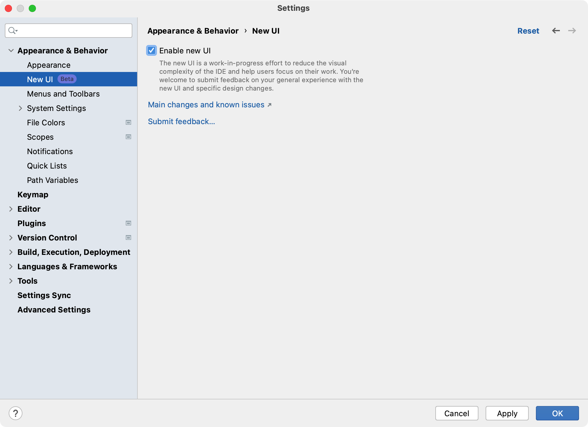
So, when JetBrains announced they were working on a new UI which “reduces visual complexity, provides easy access to essential features, and progressively discloses complex functionality as needed – resulting in a cleaner look and feel.”, many people flipped out.
Angry blog posts were published, such as this jeremiad. There were complaints on HN that received many upvotes.

Obviously, people are entitled to their feelings and I can definitely understand being concerned about a fundamental overhaul to the look and feel of a tool that, for many developers, is their “daily driver.”
But the criticism and hesitation would make more sense if the proposal was for swapping out a bunch of the UI and remaking it in another form. That’s not what the new UI is though. The new UI gets rid of UI. It’s subtractive, not additive.
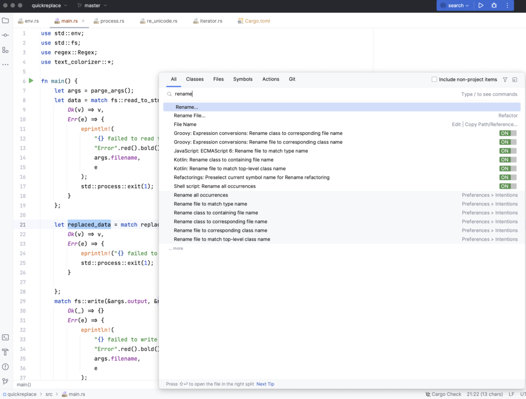
Observe:
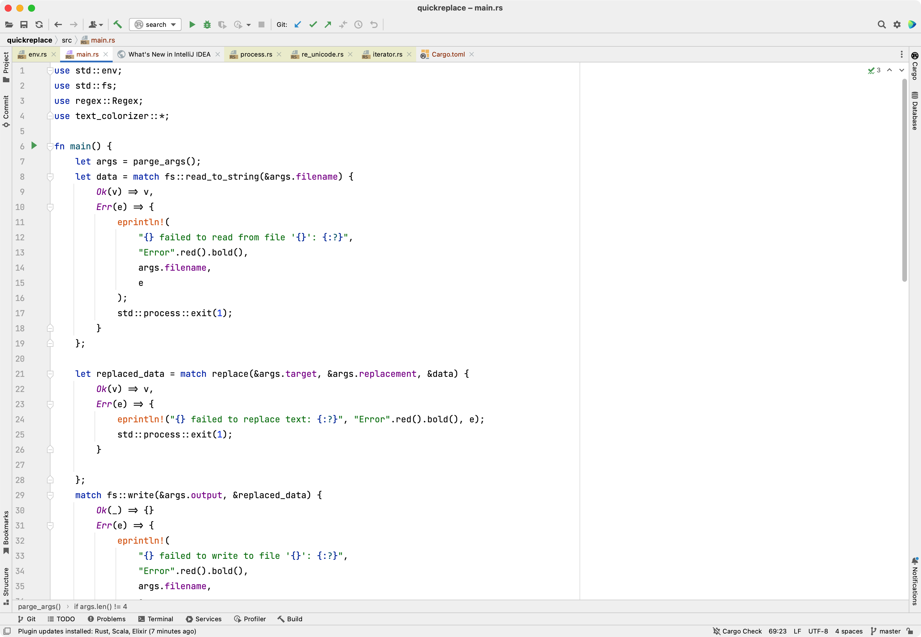
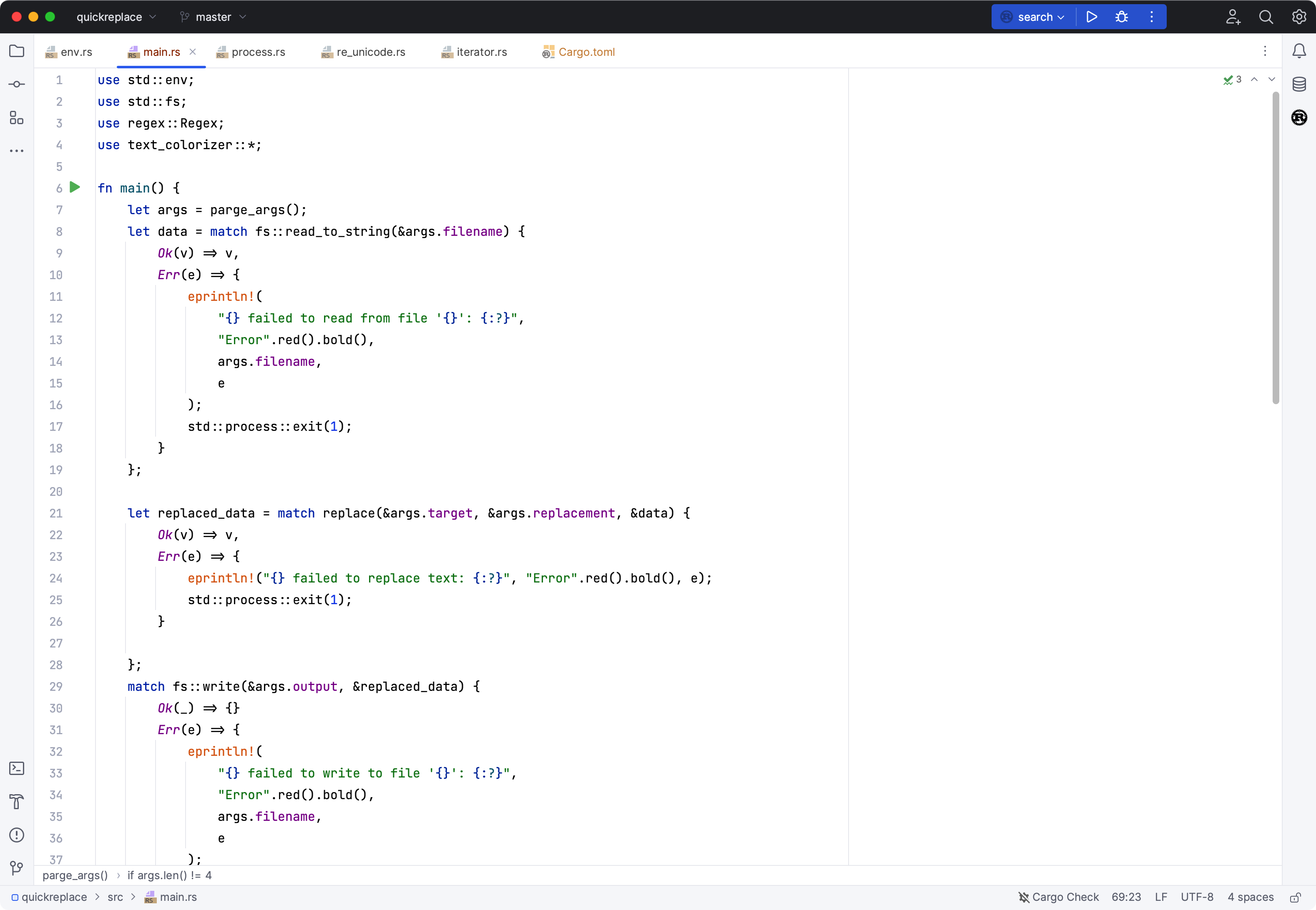
As you can see, there’s just less UI altogether. The focus is the editor, which is what the focus of an IDE should be, in my opinion. Actually, some people have even more UI in their existing setup than I do in the “old UI” above (I’ve already removed some toolbars, etc) so the before and after could probably be even more dramatic.
I suspect part of what’s behind the pushback is the way some people are using JetBrains’ IDEs, which is that they actually point and click on all the buttons and toolbars, etc. I can’t recommend enough to not do that. Learn the keyboard shortcuts. You will be 10x (barely an exaggeration) more productive if you learn to use the keyboard shortcuts. I die a little bit inside anytime I watch another person reach for their mouse and navigate around the editor at a glacial pace.
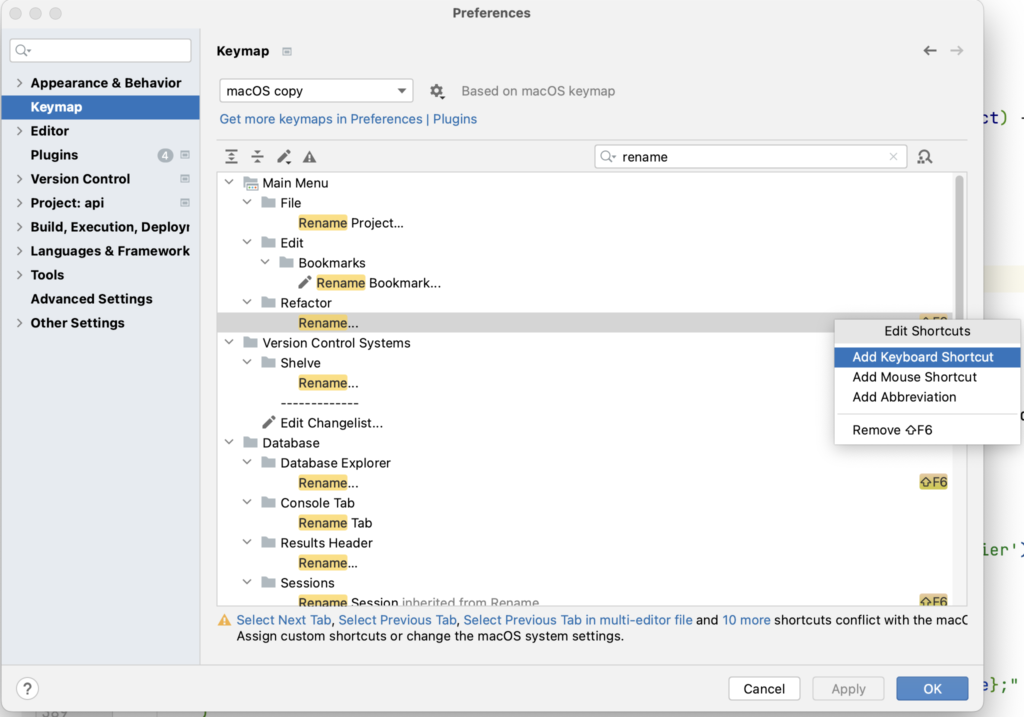
If you don’t know the keyboard shortcuts, learn them. Install the Key Promoter plugin which will bug you to use the keyboard every time you reach for the mouse. If some action doesn’t have a convenient shortcut already, add one.
Even if you don’t know a shortcut, it’s usually faster to search for that action (cmd + shift + a). If you can’t memorize even that shortcut, then just double tap shift and start typing whatever it is you’re looking to do.
So, I personally don’t really get the pushback. Maybe you don’t like rounded corners or the flat UI. I personally don’t mind it, but ok, I hear ya. However, if you’re navigating the IDE and triggering actions with the keyboard, as you should be, then an overhaul which is a net removal of UI, seems like a clear win to me.